
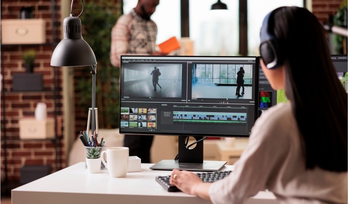
In this dramatic digital age, where people access everything from a myriad of devices with varying sizes, shapes, and colors, it becomes quintessential to strategize responsive design in an optimal way.
The design not only needs to be technically adaptive but also appealing enough to not lose its essence when viewed across multiple media.
Therefore, through this blog, we will try to understand and explore responsive design strategies in graphic designing in this contemporary digital world.
Understanding Responsive Design in Graphic Designing
As the name suggests, responsive design means a dynamic design that adapts itself to different devices, screens, and orientations without losing its essence and aesthetics. This way, the design becomes a one-size-fits-all solution that feels tailored to each person’s needs.
Now, this may sound quite straightforward by definition, but the nitty-gritty involved in this makes it a tough skill to master and implement in today’s competitive graphic designing world.
This is because, in today’s times, where aesthetics, functionality, and technology go hand in hand, responsive design is not just a technical requirement but also a creative challenge.
One has to think beyond static layouts and rigid 2D ideas to convey the brand’s message without any loss of visual appeal, no matter the device.
Well, the core ideas behind responsive design in graphic designing are flexible grids, fluid images, and CSS media queries. Let us explore them one by one.
Responsive Design Strategies in Graphic Designing
1. Fluid Grid Layouts
One of the primary strategies in responsive design is the use of dynamic fluid grid layouts. These grids are designed to reflow and readjust using relative units like percentages rather than fixed units like pixels.
Therefore, instead of a fixed rigid mosaic of blocks of graphics, fluid layouts rearrange themselves gracefully to attain the cohesiveness and structure needed at the moment on any device.
2. Flexible Images and Media
Earlier, we talked about fluid layouts, but flexible images and media are a challenge on another level. This adjustment and art direction can be complex to play out in real-time, but still, the basic idea is to set maximum widths to 100% so that images can shrink and expand without losing their essence and quality.
3. CSS Media Queries
This is where the maximum control is obtained in design responsiveness. Although operating CSS media queries requires advanced technical know-how, this is the best bet for graphic designers to tweak width, height, orientation, font size, padding, and margins to improve readability and visual hierarchy.
4. Mobile-First Design Approach
More than a strategy, having a mobile-first design approach is a principle or ethic in responsive design. Instead of designing for desktops first and then scaling downwards, designers think and design with the smallest screen resolution and scale up from there. This principle also works great to enhance touch response and address limited space issues effectively. Graphic Design Institutes in Rajkot often emphasize this approach in their curriculum to ensure that students are adept at modern, responsive design techniques.
5. Performance Optimization
Performance is a critical aspect of responsive design in graphic designing. High-resolution images, complex graphics, and heavy animations can slow down a site, especially on mobile networks. Designers should employ techniques like image optimization, lazy loading, and using scalable vector graphics (SVGs) to ensure fast loading times.
Additionally, designers can make use of modern web technologies, such as WebP images and responsive typography, which adapts font sizes based on screen dimensions and user preferences, to enhance both performance and accessibility.
6. Responsive Typography
Some ethics are better learned with practice. Responsive typography is one of those precious learnings for graphic designers. Typography is truly a hack to enhance readability and maintain aesthetic quality. Techniques like viewport width (vw) units manage text fluidity with screen size.
Moreover, the line height and length management through typography immensely enhances the reading or viewing experience without requiring excessive scrolling, eye strain, or strain on fingers.
7. Consistent User Experience
Consistency is key to loyalty and first impressions. Would you be impressed if the layout and design kept changing across devices? Would you feel the brand is reliable if their colors, palette, typography, and iconography kept changing across devices? It is the consistency in overall design, overall aesthetic hygiene, and readability that wins the trust of the user and compels them to return or at least make the call to action.
The Creative Edge in Responsive Design
As mentioned earlier in this blog, great responsive design is not just a technical prerequisite but also a challenge in the canvas of creativity.
It may seem that designers are working on redundant ideas when designing for digital projects.
It is your duty and right to experiment with layouts, animations, typographies, and user behaviors that match the needs of the time and tech. Responsive design in graphic designing is not just a technical necessity; it’s a canvas for creativity.
Conclusion: The Future of Responsive Design in Graphic Designing
To the aspiring graphic designers aiming to refine their responsive design skills, here is a word of caution—not literal but metaphorical.
The caution is that the term “responsive design” may or may not remain popular for long. You know why? Because in the near future, technology is going to exponentially transform the way we interact and immerse ourselves in illustration and graphic designs.
Also Read:
The full-blown alteration through technology may not be enough to be contained in the term “responsive design.” We can expect better foldable phones, wall-sized screens, screens as projects and casts, and non-hard screens. Who knows what’s next?
It will take a whole new set of efforts to systematize the responsiveness in graphic designs. In a future that is not far, knowledge of technology will play the most crucial role in reading users’ aesthetic preferences and what makes their content consumption truly experiential. So the final piece of advice? Learn technology as much as traditional grammar in graphic design. And yeah, don’t leave behind the creativity!
Latest Articles
- All Posts
- 3D Animation
- Blog
- Graphic Design
- Video Editing


Wonderful post however I was wondering if you could write
a litte more on this subject? I’d be very grateful if you could
elaborate a little bit further. Cheers!
famous rubber keychain
Stone Display Rack
http://www.portalventas.net
coffee robot
csgo case opening
Multi Function Floor Display Rack
Vertical Wooden Floor Ceramic Display Rack
cheap onekick.ru shoes adidas Pro Model – Promo “Big Sean” sneakers
Curtain Flip Display Stand
cheap www onekick ru adidas Ultraboost 22 low-top sneakers
rep onekick.ru reps adidas Ultraboost 20 “Triple White” sneakers
csgo case opening
rep onekick.ru reps adidas IF2421 low-top sneakers
csgo case opening
rep onekick reps adidas NMD_R1 “Solar Red” sneakers
Tile Display Rack
Diamond Water Pitcher 1.5ltr
cheap lv artsy bag LV Bags 19B570167
cheap cheap lv outlet LV Bags 19B570168
Beverage filling machine
Glass Jug With Flat Cover 1.2ltr 1.5ltr 1.8ltr 2.2ltr
cheap lv artsy LV Bags 19B570179
cheap cheap lv outlet LV Bags 19B570170
cheap lv artsy LV Bags 19B570173
famous rubber keychain
Injection Molding
EcoCater Series Green Electric Chafer with Different Covers
Diamond Coffee Pot With Scale 1.6ltr
Square Hammered Water Pitcher 1.2ltr 1.5ltr 1.8ltr
csgo case opening
http://www.faarte.com.br
coffee robot
affordable new latest hand purse Gucci Ophidia GG small shoulder bag
affordable ysl sumki Gucci Ophidia GG small shoulder bag
cheap ladies bag ladies bag ladies bag Gucci Ophidia GG Marmont
Hot Sale Aluminum Led Wireless Cordless Lantern Table Lamp
best rubber keychain
coffee robot
csgo case opening
Bamboo Massage Wooden Portable Anti-Static Mini Hairbrush
2024 Luxury Portable Trimmer Eyebrow Beauty Kit
famous rubber keychain
http://www.sudexspertpro.ru
cheap louis vuitton new blue bag Gucci Ophidia mini round shoulder bag
cheap louis vuitton purse how much Gucci Ophidia GG Marmont
Injection Molding
Metal Iron Cordless Rechargeable LED Mushroom Table Lamp
Razor Wheat Straw Tool Biodegradable Trimmer Eyebrow Kit
Top 7 Responsive Design Strategies in Graphic Designing – ArtShala
[url=http://www.g90xn424d09vqnya190h141x263hsyols.org/]ufzqmorokfr[/url]
fzqmorokfr http://www.g90xn424d09vqnya190h141x263hsyols.org/
afzqmorokfr
http://www.linhkiennhamay.com
cheap louis vuitton handbags and shoes
WLDMNT SUPPORT
Pedal ASSY THROTTLE ASSEMBLY
THROTTLE ASSEMBLY
Front Dumper Support Weld ASSY
cheap louis vuitton handbags and purses
cheap louis vuitton handbags damier azur
cheap louis vuitton handbags china
Short Gear Box Pedals Bracket
cheap louis vuitton handbags and free shipping
Custom Wholesale Pink Hair Volumizing Hair Straightener
Reading Decorative Lamp Nordic Designer Creative Table Lamp
cheap lv bags sale
cheap lv bags images
https://www.streetledlight.com/blog/innovative-led-lighting-solutions/
https://www.streetledlight.com/blog/guide-to-high-quality-led-suppliers/
cheap lv bags online
cheap lv bags usa
sceaindia.org
13pcs Foundation Blending Face Concealer Makeup Brush
Japanese Living Room Bedroom Hotel LED Paper Table Lamp
https://www.displayaled.com/blog/transform-your-space-led-tips-2025/
https://www.displayaled.com/blog/creative-uses-of-led-strip-lights/
cheap lv bags outlet
https://www.streetledlight.com/blog/global-standards-for-led-imports/
Hot Selling Decorative Rechargeable LED Golden Table Lamp
https://www.gumballcandymachine.com/blog/trends-in-health-vending-machines/
cheap louis vuitton and other brands
Stainless steel Filled PTFE Tube
Aluminum Oxide filled PTFE Tube
cheap louis vuitton and gucci handbags
PEEK Filled PTFE Tube
https://www.gumballcandymachine.com/blog/innovations-in-capsule-dispensing/
https://www.ecaelectric.com/blog/top-5-electrical-safety-tips/
cheap louis vuitton artsy gm handbag
quawas.jo
Modified PTFE
cheap louis vuitton apparel
cheap louis vuitton and china
https://www.pieflights.com/blog/tips-for-sourcing-quality-lighting-manufacturers/
https://www.gumballcandymachine.com/blog/soda-stream-trends-2025-insights/
25% Glass Filled Red Pigment PTFE Teflon Tube
https://www.cncequipmentsales.com/blog/cnc-parts-quality-supplier-factors/
Канализационный Насос
cheap lv wallets for men
Погружной Насос
yujyakai.kir.jp
New Design Non-stick Soup Pot Kitchen Cookware Round Casserole
https://www.yuanzhongpacking.com/blog/top-tips-for-quality-pp-bags/
cheap lv wallet
Садовый Насос
Professional Wireware Medium Duty Skimmers
https://www.medicalsuppies.com/blog/teeth-whitening-powder-insights/
cheap lv wallets
https://www.yuanzhongpacking.com/blog/innovative-packaging-beyond-pouches/
cheap lv sunglasses
https://www.medicalsuppies.com/blog/dental-guard-innovations-2025/
cheap lv women wallet
swenorthrental.se
https://www.chocoartists.com/blog/top-tips-for-quality-chocolate-gear/
New 200CC Capacity Waxing Machine Fast Heating Fast Melting
cheap lv scarf
cheap lv purses outlet online
https://www.chocoartists.com/blog/innovations-in-cocoa-drying-tech/
cheap lv purse
New Arrivals Portable Foldable Silicone Single Wax Pot
Muliti-type Hair Head Silicone Comb Shampoo Scalp Brush
cheap lv sale
https://www.chocoartists.com/blog/sourcing-quality-cocoa-roasters-tips/
https://www.carsavior.com/blog/guide-to-wheelchair-accessible-vehicles/
https://www.chocoartists.com/blog/chocolate-tempering-equipment-guide/
cheap lv purses
Portable Small Hair Remover Pot Wax Heater Warmer Machine
Hot Waxing Machine Low Temperature Wax Melting Pot
Pull Type Collet
Decoiler
Heavy Duty Flag Pole
cheap louis vuitton nen wallets
Mini Croquet Set
cheap louis vuitton online
cheap louis vuitton neverfull
cheap louis vuitton out let
https://www.handsomecroquetzh.com/blog/elevate-your-game-croquet-tips/
Levelling Machine
cheap louis vuitton outlet
Divided Serving Tray Of Different Size
Divided Serving Tray
Storage Box
http://www.klickstreet.com
https://www.disituflagpole.com/blog/boost-brand-visibility-with-flags/
https://www.hydraulicbuffer.com/blog/optimize-tractor-hydraulic-pumps/
G-11 Glass Epoxy Washer
Flange Insulation Gasket Kits
https://www.tclhealthyvending.com/blog/snack-vending-innovations-ahead/
cheap replica of louis vuitton shoes
Flange Insulation Kits Type E
cheap sales louis vuitton damier belts
https://www.byartmedical.com/blog/infection-and-pain-management-challenges/
https://www.whealthech.com/blog/global-wild-lettuce-extract-guide/
G-10 Glass Epoxy Washer
Flange Insulation Kit Dimensions
intouch.com.tn
cheap replicia louis vuitton handbags
cheap safe louis vuitton handbags
https://www.kimelectrical.com/blog/hydraulic-cylinder-performance-evaluation/
cheap replica lv wallets
Hood Support W.A
epoultry.pk
https://www.ncgreenpower.com/blog/sourcing-premium-solar-storage-solutions/
cheap louis vuitton diaper bags
cheap louis vuitton dog carrier
Lever Bracket WD. ASSY
Cooling Structure W.A
cheap louis vuitton duffle bag
Hood Reinforcement
CJ SD SUP COXINS LE
cheap louis vuitton dog carriers
https://www.asiamachineries.com/blog/standards-for-quality-packaging/
cheap louis vuitton duffle bags
https://www.russdoors.com/blog/choosing-smoke-proof-sliding-doors/
https://www.yuanzhongpacking.com/blog/versatile-stand-pouch-bags-guide/
Electric Anal Plug
Cutter Suction Dredger
cheap louis vuitton suit hanging bag
https://www.eirobotica.com/blog/robot-coffee-machines-in-hospitality/
https://www.doordashcorp.com/blog/7-tips-for-sliding-patio-door-install/
cheap louis vuitton sunglass
https://www.eirobotica.com/blog/choosing-the-right-coffee-robot/
https://www.doordashcorp.com/blog/glass-patio-doors-aesthetic-efficiency/
Backhoe Dredger
cheap louis vuitton suitcase
cheap louis vuitton stuff
Hopper Dredger
Split Hopper Barge
Dredger Ship
https://www.eirobotica.com/blog/future-of-automated-coffee-brewing/
cheap louis vuitton suitcases
http://www.ctauto.itnovations.ge
High Current D-Sub Combo 17W2 D Connector
cheap louis vuitton scarf
cheap louis vuitton replicated handbags
Type S Check Valve
Combination 21W1 D-Sub High Current Connector
做SEO找全球搜
做SEO找全球搜
cheap louis vuitton rolling luggage
cheap louis vuitton scarf for men
http://www.krishakbharti.in
做SEO找全球搜
D-Sub 13W6 Combination High Current Connector
cheap louis vuitton sale
做SEO找全球搜
做SEO找全球搜
D-Sub Combination 5W5 High Current Connector
做外贸找创贸
Солнечный Насос
Циркуляционный Насос
Коммерческая Центрифуга
cheap authentic louis vuitton
cheap authentic louis vuitton backpack
http://www.status.megedcare.com
做外贸找创贸
cheap authentic louis vuitton alma mm
Трубопроводный Насос
womens louis vuitton wallets
谷歌排名找全球搜
谷歌排名找全球搜
cheap authentic louis vuitton backpacks
做SEO找全球搜
Глубокий Скважинный Насос
谷歌排名找全球搜
谷歌排名找全球搜
做SEO找全球搜
Laundry Folding Trolley with Oxford Bag
全球搜SEO排名首页保证
cheap lv speedy 30
cheap lv sunglasses
faarte.com.br
Laundry Trolley with Oxford Bag
cheap lv sling bag
Room Service Cart
cheap lv sneakers
Room Service Cart with Single Linen Bags
cheap lv shop
谷歌排名找全球搜
Luggage Cart
Portable Electric Face Vacuum Cleaner Home Beauty Apparatus
cheap louis vuitton clutch black
Potato Flakes Processing Line
7 Color Light Neck Massager Face Massager Tool for Skin Care
Jujube Fruit Extract
journal.fujispo.com
Microcurrent Facial Device Vibration Neck Lifting Massager
Double Sliding Door
Sun Uv Light Fast Drying Gel Nail Dryer UV Led Nail Lamp
Carbon Gravel Fork
cheap louis vuitton clutch
Gold Mining Trucks
cheap louis vuitton china handbags
cheap louis vuitton clutches
cheap louis vuitton china
Ultrasonic Skin Scrubber Spatula Face Cleansing Device
Rabbit Vibrating Egg
Clitoral Suction G-Spot Vibrating Egg
Ac Dc Tig Welder
G-Spot Vibrating Egg
cheap lv sling bag
cheap lv sunglasses
Commercial Playground
Magnetic Fixing Plate
http://www.huili-pcsheet.com
Tongue Licking Vibrating Egg
cheap lv sneakers
cheap lv shop
Sports Shoes
Logistics Third Party
cheap lv speedy 30
Patting Vibrating Egg
Industrial Packaging
cheap vintage louis vuitton handbags
cheap tivoli gm louis vuitton
cheap sales louis vuitton damier belts
Automatic Coffee Shop
Braided Packing
Aramid Fiber Packing
Graphite Packing
cheap travel bags louis vuitton
cheap small louis vuitton handbag
temperatrice di cioccolato
Checking Electrical Equipment
Lighting Ceiling
PTFE Packing
Mineral Fiber Rubber Gaskets
cheap louis vuitton pet carriers for sale
Frozen Squid Tentacles
做SEO找全球搜
Vacuum Pump
Magnetic LED Circular Night Light
Mobile Power Inverter
COB Strip 4500K 24V
COB Strip 6000K 24V
help.megedcare.com
cheap louis vuitton pet carriers
COB Strip 6000K 12V
cheap louis vuitton pants
COB Strip 6000K 5V
Concrete Top
cheap louis vuitton passport cover
cheap louis vuitton pet carrier
Suit Supply Shirts
Bits And Bits Router Bits
Military Bags
Forklift Rentals
http://www.kotech.co.jp
cheap lv bags outlet
13pcs Foundation Blending Face Concealer Makeup Brush
Micro Load Cell
cheap lv bags online
cheap lv bags usa
Hot Selling Decorative Rechargeable LED Golden Table Lamp
cheap lv bags images
Japanese Living Room Bedroom Hotel LED Paper Table Lamp
Reading Decorative Lamp Nordic Designer Creative Table Lamp
Custom Wholesale Pink Hair Volumizing Hair Straightener
cheap lv bags sale
Directional Control Valve WE 5 for Rexroth
Types Of Mining Trucks
cheap handbags wholesale usa louis vuitton
Directional Control Valve 4WE 6 D for Rexroth
Directional Control Valve WE 4 for Rexroth
Prefab Houses For Sale
Paper Dye
Directional Control Valve WMU
electrical stimulation device
cheap fake louis vuitton wallet
cheap handbags louis vuitton
cheap genuine louis vuitton handbags
Directional Control Valve WMR
Car Charging Stations
cheap fake louis vuitton speedy 25
http://www.knf.kz
Clutch Master And Slave Cylinder
cheap louis vuitton us
Strap Handles
Folding shape PTFE envelope gasket
cheap louis vuitton uk
EPDM rubber gasket
Silicone rubber gasket
Pure White PTFE Gasket
sk.megedcare.com
cheap louis vuitton travel men totes
cheap louis vuitton travel bags
Solar Pillar Lights
Fluorine rubber gasket
cheap louis vuitton travel luggage
Wallbox Charge
Waterproof Backpack
cheap louis vuitton pillow cases
High Pressure Zinc Die Casting Parts
High Pressure Die Casting Tooling
Home Furniture Coffee Table
Aluminum Die Casting Industrial Parts
cheap louis vuitton pet carriers
High Pressure Die Casting
http://www.kotech.co.jp
Pallet Rack Beams
cheap louis vuitton pet carriers for sale
Meal Worms Bird Food
cheap louis vuitton pochette
Cloth Bags
cheap louis vuitton pocketbooks
Aluminum Die Casting Auto Parts
Led Garden Lights